BioClinic
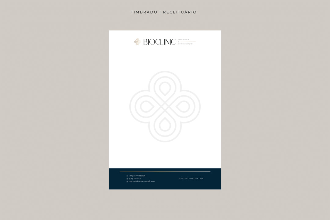
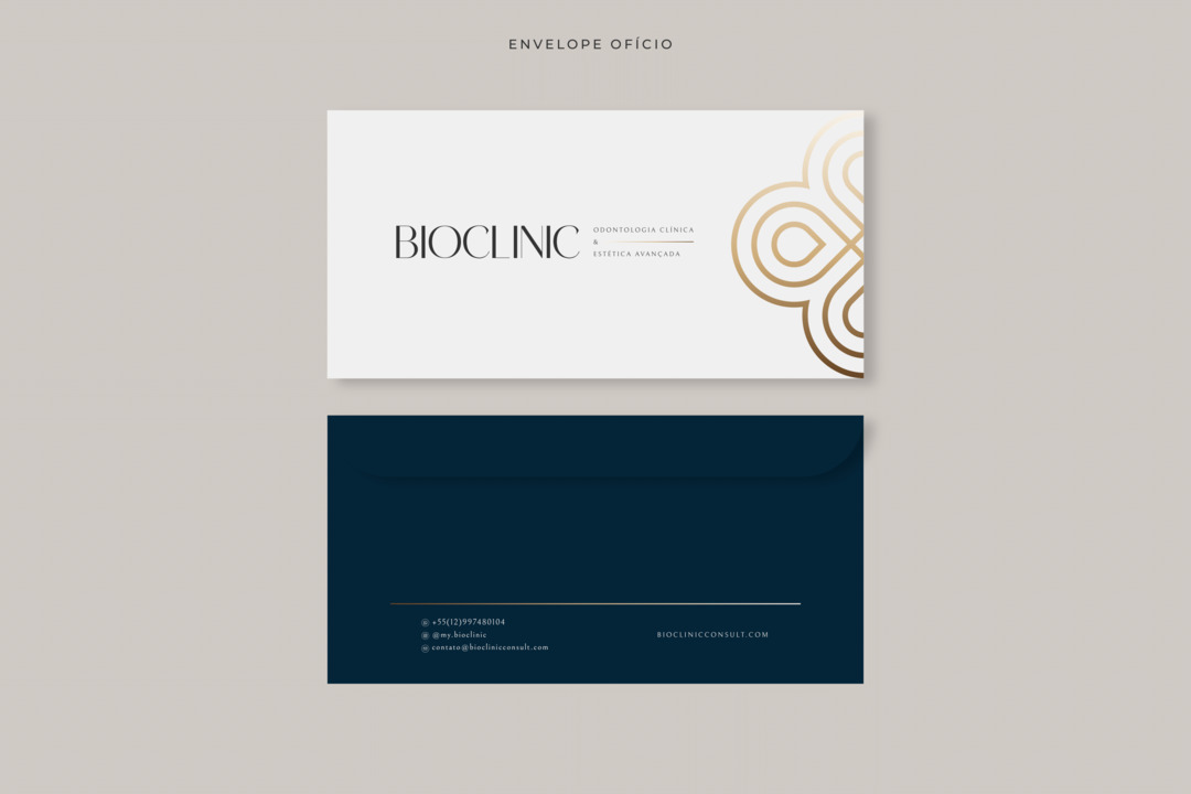
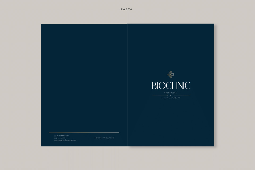
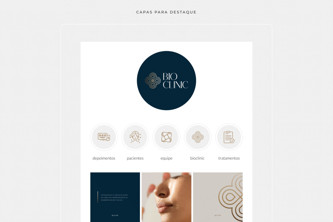
One of the key elements of BioClinic's visual identity is its unique symbol. This symbol was created from the brand's initials to represent its essence in a simple and memorable way.
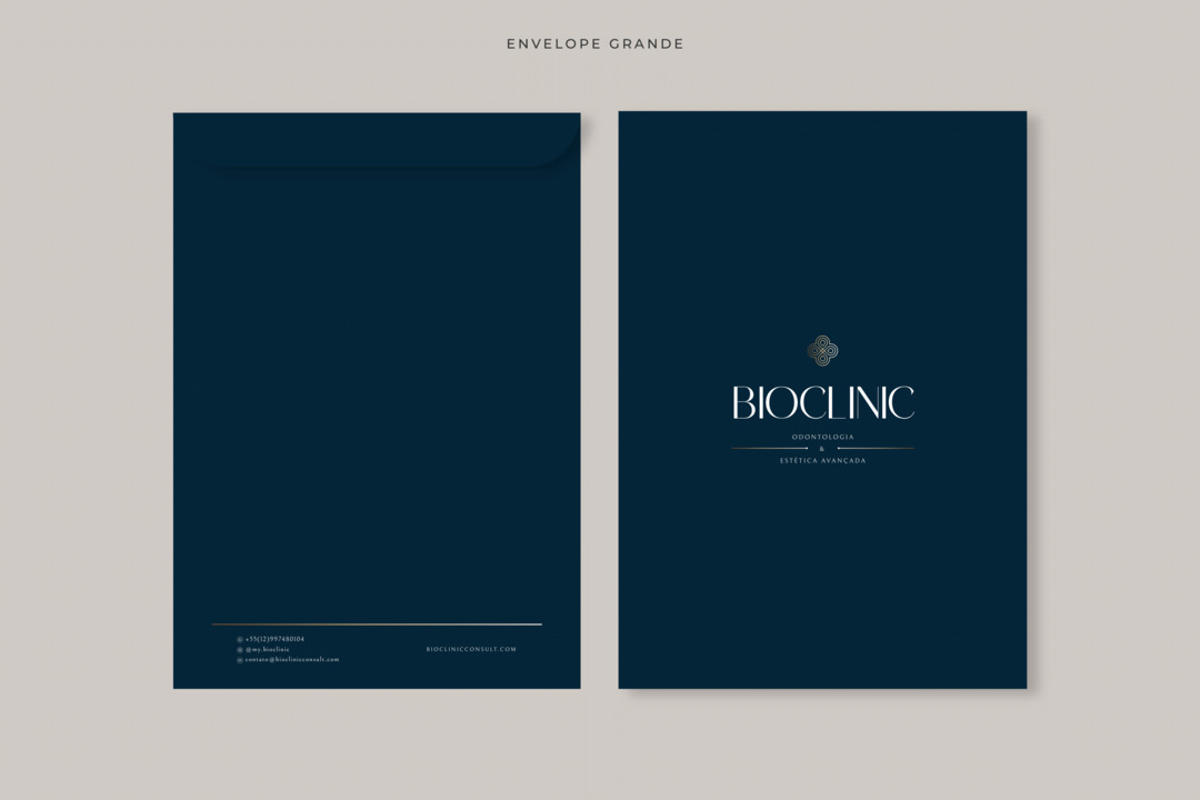
The chosen colors for BioClinic's visual identity also play an important role. Petrol blue is a color that conveys seriousness, trust, and stability. It's often associated with health and technology, which aligns perfectly with the brand's proposition. White is a color that brings a sense of purity and cleanliness, conveying the idea of hygiene and care. Gray adds a touch of sophistication and neutrality, while gold introduces an element of luxury and prominence.
SERVICES:
Visual Identity, Digital Art
